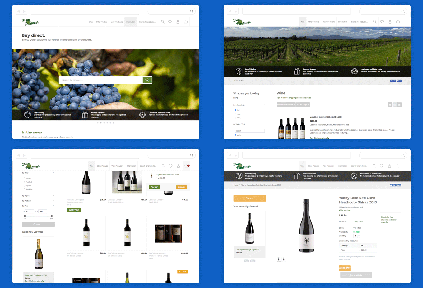
Try re-sizing this window. Notice how the content moves depending on what size your window is? This is responsive design! It means that your email will look good no matter what size device you’re using to access it. It’s more important than ever before to have a design that works well on both desktop and mobile devices with more of us checking emails on the go.
Email still has many limitations compared to to current techniques for websites and some emails are still designed using images for the layout. Layout by images can look great on one device size but will compromise the look on another size device, not to mention the lack of accessibility for those who are visually impaired. The 2017 State of Email Report by Litmus states that:
“51% of consumers have unsubscribed from a brand’s promotional emails because their emails or website didn’t display or work well on their smartphone.”
At SWiM we are making sure all new email builds are responsive and accessible. We are also including enhancements for email clients that DO provide support for the extra features. One of these features, for example, can be seen on our latest newsletter email under featured work; the GIF animation will be seen in most web based email clients but not in some versions of Outlook.

In cases where the animation is not supported you will see only the first frame as a non moving image. There are a few techniques like this that can be used to enhance designs for some email clients while keeping it simple for those that do not have the extra support.
Read more about the technical aspects of responsive web design here:
We’ve been testing a few different methods for developing emails and found these to be helpful resources in getting responsive to work for email:

